
Cover Art Makeover: The Winner's Trilogy
12:57 PM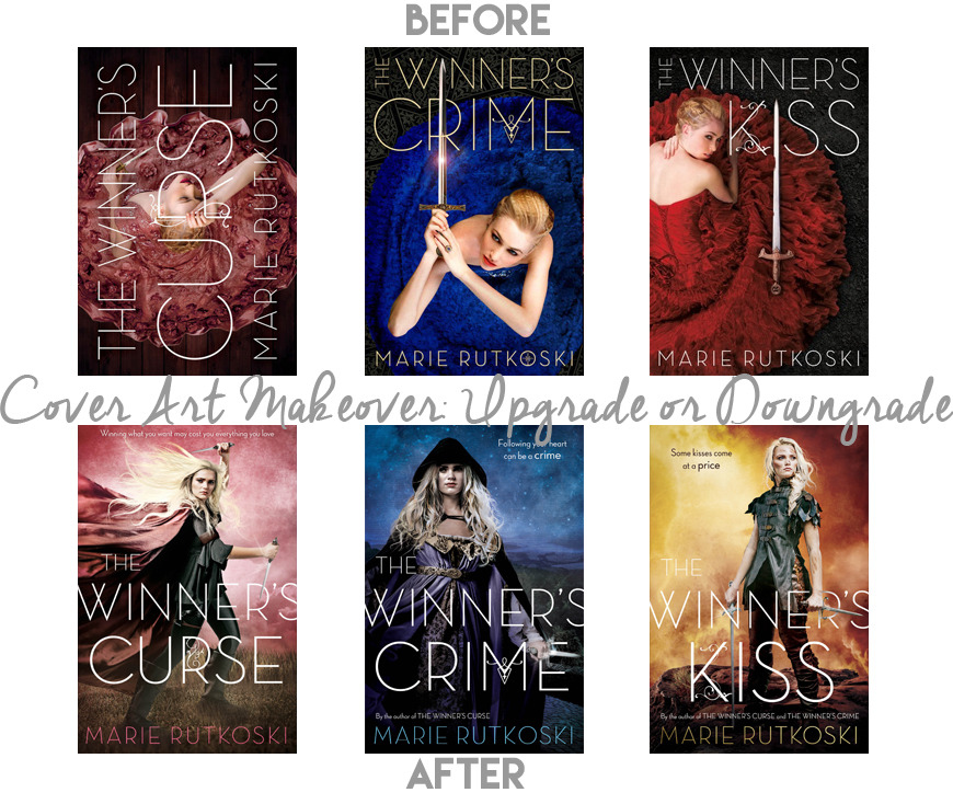
(To say we, as fans, are pissed would be an understatement. I will say it now: this is one of the worst changes they could have done to the cover art of a series that is still unfinished.)
Firstly, the original covers reflect the story perfectly and showcase who Kestrel is and aesthetically speaking they are simply gorgeous. They are one of the view releases that properly use the whole "girl in a dress" angle and make it look good. Not just good, badass. One of the things that is so striking about her as a character is she is a lady, so she dresses the part, and her mind is her biggest weapon. Although the tweet has been deleted since, Fierce Reads commented on the change to make our leading lady look "more badass"--as if being badass is impossible in the attire described previously.
Scoff.
But hey, as long as she looks badass and not at all like what she'd actually wear, who cares, right?
In spite of society growing in some ways when it comes to femininity and strength, for some reason those who are marketing this gem don't think the two combine. More importantly, changing covers to reflect something else entirely is not going to attract readers, it is going to lead to conflict as opposed to what the book actually is.
In my eyes, these new editions are fine and dandy and don't change my desire to read the series. They don't match my collection and while that bugs me it isn't the end of the world. It isn't that they are hideous--they aren't my cup of tea, per say, but they aren't horrid. It is simply that they do not match the content and seem to want to mirror Throne of Glass as opposed to, well, The Winner's Trilogy.
I'm definitely feeling bummed about this change and I know I'm not alone. The original covers are so pretty it feels like a shame/waste to me and a cheap rip-off of other fantasy novels. Which is unfair to the series, as it's one of the best.
Plus, how gorgeous was that typography in the first novel especially?
Sigh.
Well, time changes everything I suppose...
This is just all kinds of downgrade.
Plus, how gorgeous was that typography in the first novel especially?
Sigh.
Well, time changes everything I suppose...
This is just all kinds of downgrade.


0 comments