
Top Ten Tuesday: Cover Redesigns I Loved + Hated (#52)
11:00 PM

For those of you who are new to my blog, or the book blogging community, Top Ten Tuesday is hosted by That Artsy Reader Girl, originating over at the Broke and the Bookish, and is exactly what its title hints at. Each week we're given a topic to explore in our entries.
It's not uncommon for covers to be redesigned over time. Sometimes, they happen too frequently. A lot of these redesigns are actually improvements and conscious marketing choices that really pay off in the long haul. Others are more... questionable. They are the Glee of change: that first cover was SO GOOD and anything after it was a trashfire, kind of like the first two seasons of Glee being great only to steadily go downhill afterwards.
One of the more frustrating turns when it comes to redesigns is when they happen mid-series and suddenly, you have all kinds of clunky mismatching going on. I have a real issue with that. At the same time, is it really book collecting if Jessica doesn't have a complete meltdown over books not matching in some way? I'm kidding. Mostly.
Going at this topic, I'm going to skip out on listing books like Harry Potter, The Shadowhunter Chronicles and more recently the Whims of Fae series. Another series to get the "honor" of being not mentioned in this post is The Diviners (ugh!) and the fact that it's gone through so many makeovers since its initial publication it now has A DIFFERENT STYLE/AESTHETIC FOR EACH BOOK.
IT'S VERY STRESSFUL. Send help. *whispers* I've fallen and I can't get up. I'm--going off the rails a bit again, aren't? I'm sorry. I talk about the above mentioned series so much that I'm pretty sure some of you guys are about to reach the WE GET IT, JESSICA, BE QUIET endgame explosion.
(Which is fine in theory because I'm totally there with you guys--I'm ridiculous. Ha, ha, we're all friends here.)
But, honestly? I'm weak. If you guys yell at me I'll definitely call up my best friend (hi, Sammy) and cry about it. Which isn't a fun experience for me or her. You really don't want to do that to her, right? Right?!
In all seriousness, this was an easy breezy topic to write about. Mostly because I'm a natural at complaining. Rumor has it, my first string of words was: "This crib is uncomfortable, can I go back to the womb, Mommy?" (That's a lie, by the way. I totally had you going.)
Shatter Me by Tahereh Mafi


Verdict: Loved.
The new design for the series really plays into the novels atmosphere. It is a definite improvement on the original design of Shatter Me. I can't really imagine what the rest of the series would have looked like, had they gone with that version of Shatter Me. It is just so intensely awkward. We're fortunate they caught onto that shortly after Shatter Me was published and before we had more than one book with a similar design. I'm glad they changed the design for it. The subtle creepiness of the eye paired with the brightly coloured theme? *chefs kiss*
The Winner's Trilogy by Marie Rutkoski
Original:


Redesign:


Verdict: Hated.
I've been pretty vocal about how much I dislike the newer designs of these. Honestly, who hasn't? It's not even that they're bad. It just doesn't work. It is weird, because normally I'd be all for changing that typical "Pretty girl in a big dress" trope that YA has going on with their books. It just so happens that The Winner's Trilogy is one of the rare ones that this dressed up design made sense for. The other design and outfit fits neither the world or the character or the plotlines. But back to the redesign--they were trying so hard to captivate a different audience--one that would be sorely disappointed in the novels. The design isn't bad in the least, it just doesn't fit with the trilogy. At. All. The Winner's Trilogy isn't Throne of Glass, end statement.


Repackaging these novels for the television series wasn't a bad idea in theory. Tie-ins happen and we all know that. For Gossip Girl, some are really lovely. The casting for the show was brilliant and its aesthetic was certainly eye-catching. It feels weird seeing Chuck and Blair and Nate and Vanessa's pairing be prominent on the front of some of the books--where they never even dated. The covers should have been more of a fit for the books--group shots, the pairings from the book series, etc.
It's a yikes and no from me. Always. Plus, imagine how disappointed show fans were when they picked up these books and nothing matched on the inside to the outside?
It's a yikes and no from me. Always. Plus, imagine how disappointed show fans were when they picked up these books and nothing matched on the inside to the outside?
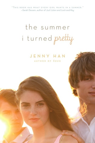
The Summer I Turned Pretty trilogy by Jenny Han
Original:


Redesign:


Verdict: Loved.
I love Jenny Han and her now iconic To All the Boys I've Loved Before series. The Summer I Turned Pretty, however, was a different story. It is one of the rare books I've had to DNF. But, I'll probably give it a chance again in the future. NOT BECAUSE I'M TOTALLY JUDGING IT BY ITS NEW AND IMPROVED AND COMPLETELY GORGEOUS COVERS. I swear. I just love Jenny Han, like, a lot, and have to wonder if it was more or less just not my time to read this series.


Redesign:


 Verdict: Loved.


I really think that this series benefited from a total facelift. Name change, cover change, everything. Even though it wasn't a big change in design, it still does wonders. I never realized how outdated the original covers were. You can definitely tell their age based on the Gossip Girl-ish vibe to the covers. I think the playful, soft look they went from in the redesign does a lot of good! I'm still not big on covers with people on them (at least, not in this way, anymore) but they're a definite improvement.
What cover changes have you love and hated through the years?


0 comments