11:00 AM
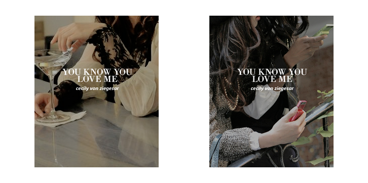
"GOSSIP GIRL" COVER ART REDESIGNS
 Now, I know what you're thinking: how bored was I to attempt to do this with no artistic ability whatsoever? It was mostly inspired by simplistic redesigns I've been seeing on Tumblr for quite some time and with all the storms we've been getting, I've found myself with some massive free time on my hands. And so I figured, eh, what the hell? If I can't go outside as often as I'd like to, why not give this a go?
Naturally, I started with the first three Gossip Girl books from Cecily von Ziegesar's bestselling series. Gossip Girl has gone on to be something of a pop culture phenomenon by hand of the bestselling books, the spin-off books it then spawned ("The It Girl" and "Gossip Girl: The Carlyles), the one-time immensely popular CW adaption (RIP!) and lastly the adaptions in other languages, most recently the fabulous Gossip Girl: Acapulco which was cancelled far too soon.
Gossip Girl will always have a special place in my life due to the fascination I've held with it since my preteen years and it felt only appropriate to use these as my first few tries. I mostly used photos from promo images, stills and behind the scenes looks at the series' original run on the CW. One of the things that annoyed me about the repackaging designs the book series was handed during the second season of the adaption was that there wasn't barely any covers which actually fit with what would be happening in the novels.
Chuck and Blair, frustratingly but unsurprisingly, held the most covers due to their ridiculously popularity amongst the shows fans in spite of never having actually been together in the book series. At least Ed and Leighton look totally smoking together, right? Now before you lay in on me: I'm not just saying this in annoyance because I never particularly shipped them. While they were in the spotlight: the main pairings, the only pairings of the BOOKS, received very little treatment. And perhaps worse off than their neglect in the show, it feels even more dumb that they didn't even try. It added insult to injury, as the books were the only places these pairings properly existed and I know a lot of fans felt that it took away from the original series.
While I understand entirely that they were, at this point, trying to market this to the shows audience (since a great deal of the book fans had tuned out rather early on... not all of them, but a massive amount) and capture their attention this has always irked me and strikes me as silly. That being said, they should have just used pictures of the characters as a group or solo. Cover art changing to match the adaptions is always silly to me, but the Gossip Girl series certainly took the cake on this for me when it comes down to the worst of the worst.
My focus in these simple, boring redesigns is to create a similar feel to the original covers. Faceless to focus on the characters and the anonymous gossip factor. I tried to not use pairings because it felt weird to me to focus solely on one, so a great deal of focus is placed on the characters on their own or Blair and Serena together as the best friends they are. It was incredibly fun to make these and I plan on continuing forward with the series, its spin offs and other books in my so-called basic redesigns.
Underneath the image previews are XO's that will link you directly to all the redesigns of these books in general which you can find on my Tumblr account. It goes without saying that these designs are not official, the original images and books do not belong to me however because the redesigns are all mine I am asking you politely to not repost or take credit for my work. While they are basic and boring, it still took me quite some time and I don't fancy my work being stolen.


0 comments